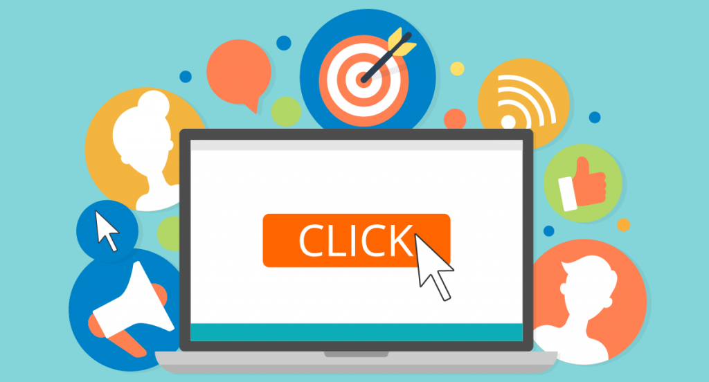
A button which doesn’t lead to convert a call is not a button to use. It is very important for any website to make its visitor click the button, as visitors who don’t click don’t covert.
But how one can force a visitor to click on the button as it is something which totally depends on visitor whether he wants to click on the button or not. Many websites get traffic on their page but they are not able to get it converted.
Here are some ways using which you can get your action button in use and make a visitor click on it
- Copy on Button:
This is the most important thing one needs to take care of, while giving a button. What you write on button is most important. It should be compelling in such a way that visitor can’t resist himself from clicking on it. The biggest thumb rule in writing copy for a button is it should always be in first button.
- Color of Button:
Visuals and colours always have a deep impact on the human mind and accordingly it reacts. So the next important thing is to be taken care of is the colour of the button. Pick a colour which is attractive enough for the visitor to click.
- Location:
Location of the button is very important. Put the button where it is easy to locate and the visitor can click it easily. Button hiding somewhere or not a place where visitor can’t find it easily will never lead to conversion. Place the button where it easily grabs the attention and compels the visitor to click on it.
- Clickable:
Make a button look like clickable. Button which is of same font and size of other text and doesn’t appeal to be clickable will never convert the lead. So always make a button look clickable, popping out, so that visitor can easily find it and click on it.
- Size matters:
Bigger is not always better. A big button is a big no, as it distracts customer from doing their work on a page which can lead to no sales conversion at all. Also too small in size would also not work, so an average size is perfect which is clickable and doesn’t distract too.
- Give less options:
When you give more choices to the customer, he/she tends to get confused which results in no sale at all. Moreover, the satisfaction rate is also low when there are more choices provided to the customer. So give selected and good choices, so that customer doesn’t get confused and click on the button to increase your sale.
When you want the call to action button to be convertible follow above-mentioned points and boost your conversion rate!